Jack Henry
Website Redesign

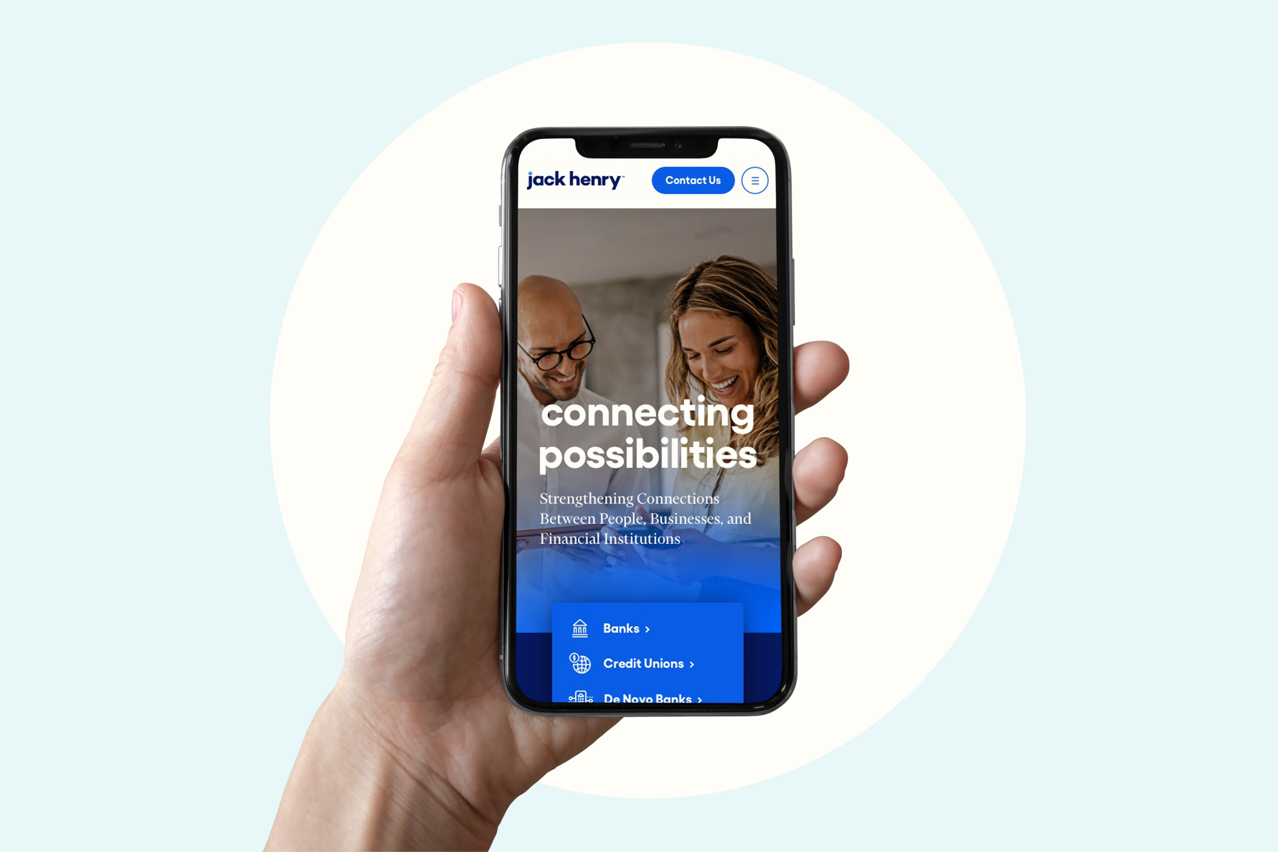
A new website for financial technology company Jack Henry that combines all of their brands into one.
Role | Associate Creative Director
Agency | Sagepath
When | 2021-2022
-
Jack Henry is a leading SaaS provider primarily for the financial services industry. They are an S&P 500 company that serves approximately 8,500 clients nationwide through three primary brands: Jack Henry Banking® provides innovative solutions to community and regional banks; Symitar® provides industry-leading solutions to credit unions of all sizes; and ProfitStars® offers highly specialized solutions to financial institutions of every asset size, as well as diverse corporate entities outside of the financial services industry.
-
They came to us in need of guidance to transform all of their brands into one company through new branding and a new website. They had multiple websites for each of their different brands and they were looking to unite the corporations under a single entity to present themselves to clients as a single company. It was time to bring it all under one consistent brand. As part of this initiative, they wanted to better convey their brand values and human-centered approach which sets them apart from their competitors.
-
First we researched, strategized, and designed the new Jack Henry visual identity, supported by a spanking new website with an easy-to-use design system.
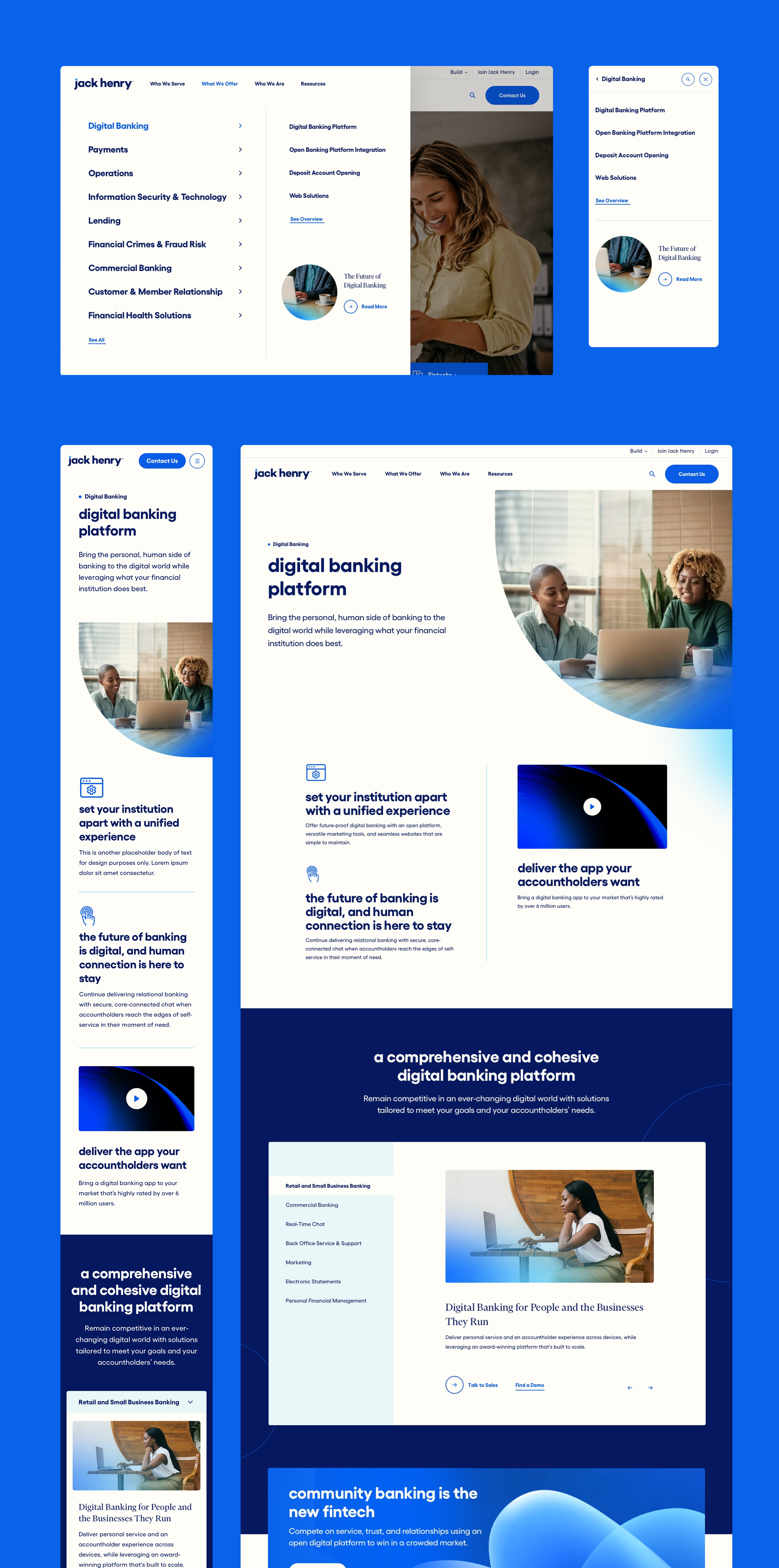
After the branding phase, we started our web design process. For their new website, we thoughtfully applied their new branding and overall made sure it was an intuitive experience for users. We created components, guidelines and general page templates to easily scale as they continue to grow and add new content to their site in future-phases. We brought to the forefront their sense of warmth, emotion and real connection to their clients that you don’t typically see in the financial services industry. In order to simplify their image, we took their complex matrix of organizations and merged multiple sites into one cohesive brand and high-performing website experience.
Phase 01: The Pitch
Our first pass at redesigning Jack Henry’s website came with the creative work we did in the pitch for them. We proposed a website that was simple yet visually dynamic through the use of gradients and organized clearly through the use of cards. The content organization was very straightforward and easy for the user to navigate. We also proposed creating a Marketplace on the site since they have over 450 offerings and having them all in one place for users to explore would make it easier for people to find what they need.
The Jack Henry Website
After we won the pitch, we immediately got to work. First we researched, strategized, and designed the new Jack Henry visual identity and overall branding (which you can see here). Once that was finalized, we proceeded to designing their new website with an easy-to-use design system.
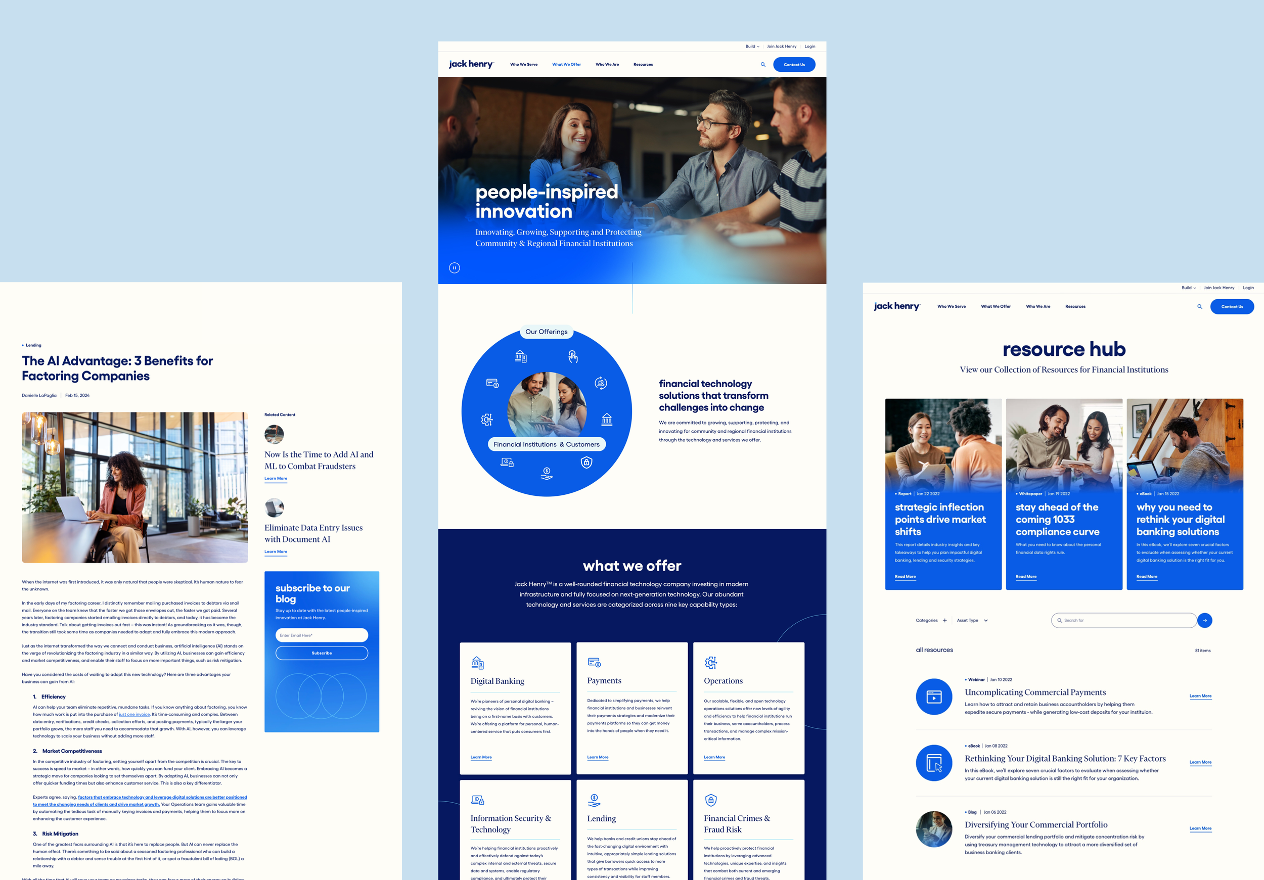
In order to simplify their image, we took their complex matrix of organizations and merged multiple sites into one cohesive brand and high-performing website experience. For the website, we thoughtfully applied their new branding and most importantly made sure it was an intuitive experience for users and aligned with their objectives. We created components, guidelines and general page templates to easily scale as they continue to grow and add new content to their site in future-phases. We brought to the forefront their sense of warmth, emotion and real connection to their clients that you don’t typically see in the financial services industry.
The end result is a vibrant and customer-centered digital experience that exudes their new branding and business capabilities with ease.


