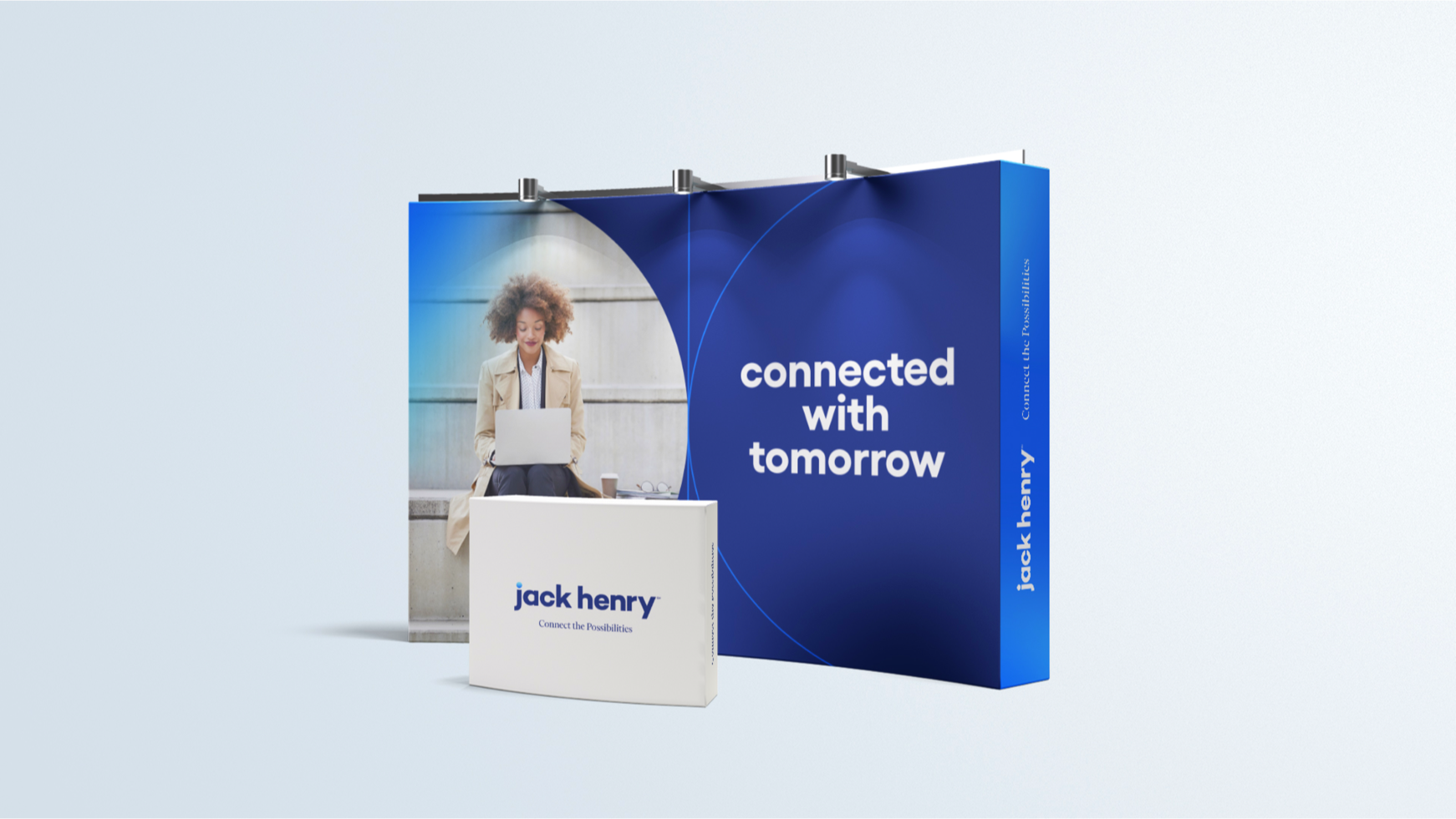
Jack Henry
Branding

Simple yet dynamic branding for financial technology company Jack Henry.
Role | Associate Creative Director
Agency | Sagepath
When | 2021-2022
-
Jack Henry is a leading SaaS provider primarily for the financial services industry. They are an S&P 500 company that serves approximately 8,500 clients nationwide through three primary brands: Jack Henry Banking® provides innovative solutions to community and regional banks; Symitar® provides industry-leading solutions to credit unions of all sizes; and ProfitStars® offers highly specialized solutions to financial institutions of every asset size, as well as diverse corporate entities outside of the financial services industry.
-
They came to us in need of guidance to transform all of their brands into one company through new branding and a new website. They had multiple websites for each of their different brands and they were looking to unite the corporations under a single entity to present themselves to clients as a single company. It was time to bring it all under one consistent brand. As part of this initiative, they wanted to better convey their brand values and human-centered approach which sets them apart from their competitors.
-
We researched, strategized, and designed the new Jack Henry visual identity, supported by a spanking new website with an easy-to-use design system.
We created a clean, simple yet sophisticated, and own-able identity. Our solution was based on the simple shape of a circle and using it to build out additional dynamic shapes to extend across their branding. The circle represents their well-roundedness in terms of their ecosystem of a vast number of solutions they offer as well as their inclusive perspective on company culture. The logotype is understated and simple with a bit of a visual punch through the bright gradient tittle over the “j”. We supplied extensive brand guidelines to support their marketing team in all future brand executions. To go along with their new identity, we closely collaborated with their team to craft a strategic repositioning of their brand through the concept of “Connecting Possibilities”. “Connecting Possibilities” adds strength to their perspective that their solutions help move people forward to financial freedom by reducing barriers and strengthening connections between people and their financial institutions. This brand positioning extends to their visuals through connective graphic elements and imagery that shows a sense of togetherness and/or a connective moment with technology.
After the branding phase, we started our web design process. For their new website, we thoughtfully applied their new branding and overall made sure it was an intuitive experience for users. We created components, guidelines and general page templates to easily scale as they continue to grow and add new content to their site in future-phases. We brought to the forefront their sense of warmth, emotion and real connection to their clients that you don’t typically see in the financial services industry. In order to simplify their image, we took their complex matrix of organizations and merged multiple sites into one cohesive brand and high-performing website experience.


